Both options share the same mark geometry, the same navy ink, and the same two typefaces. They differ only in surface colour. Choose by context, then stay in that option for the whole artefact.
Zero chroma, so nothing competes with the data on the page. Use it for reports, invoices, chart-heavy decks, letterhead, email signatures, the console shell, and any single-colour print run.
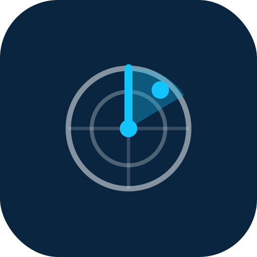
The mark is a radar: a fixed origin, a sweep, and a detected blip. Download the file that matches your background. Do not rebuild it by hand and do not recolour it yourself.
Deep navy is the ink in both options. Keep canvases white or cool grey so a single accent always reads as the signal. Grab the tokens rather than typing hexes by hand.
Status colour never travels alone. Always pair it with a word, so the state survives greyscale printing and colour blindness.
Inter carries the hierarchy. Contrast comes from size and weight, never from a third font. JetBrains Mono owns every number, ticker, ID, and uppercase label, always with tabular figures so columns line up.
Body copy sits at 16px with 1.6 line height, capped near 65 characters. Dense enough for an operating console, calm enough to read for an hour.
Never set running prose in mono. It is for figures and labels only.
We are talking to pro traders. They are sceptical by trade and short on patience. Lead with the number, name the mechanism, and stop. Never call them creators.
Every file is production ready. Vectors scale to any size, so there is no raster export to hunt for.
Mark, lockup, app tile, and the navy and light grey variants.
Gradient sweep mark, lockup, app tile, and the reversed pair for dark surfaces.
Primary mark, small sizes, colour tokens, voice rules, and the written guide.
Presentation templates, print files, and event graphics are available on request. We turn these around in a day.